

Forex charts are the visual language of the currency market. Every price movement, from a minor fluctuation to a major shift in a currency pair’s value, is captured and displayed on a chart. For anyone trying to understand how the Forex market behaves, learning how to read Forex charts is one of the most fundamental skills to develop.
At first glance, a Forex chart can look like a dense wall of lines, bars, and colors. But once you understand the structure behind it, that complexity turns into a clear, readable story about how a currency pair has moved over time. This guide breaks down the basics so you can approach any Forex chart with confidence.
The Basics: Price and Time Axes
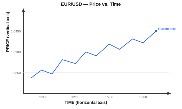
Every Forex chart is built on two simple axes. The vertical axis represents price, showing the exchange rate of one currency against another. For example, on a EUR/USD chart, the vertical axis shows how many US dollars one euro is worth at any given point.
The horizontal axis represents time. Depending on the chart settings, each point along this axis might represent a minute, an hour, a day, or even a week. Together, these two axes create a visual record of how a currency pair’s value has changed across a chosen period.
Types of Forex Charts

There are three main chart types used to display the same underlying price data, each offering a different level of detail.
Line Charts A line chart is the simplest format. It connects a series of closing prices over time with a single continuous line. Because it strips away intraday fluctuations, a line chart is useful for getting a quick sense of a currency pair’s overall direction or long-term trend.
Bar Charts Bar charts display the same open, high, low, and close data as candlesticks, but in a different visual format. Each bar is a vertical line, with the top representing the high and the bottom representing the low for that period. Two small horizontal ticks extend from the bar: the one on the left marks the opening price, and the one on the right marks the closing price.
Candlestick Charts Candlestick charts are the most widely used format among traders because they pack a large amount of information into a single, easy-to-read shape. Each candle shows the opening price, closing price, and the highest and lowest prices reached during that period, all at once.
Understanding Candlesticks in Detail
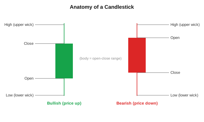
Because candlesticks are so common, it’s worth understanding their structure more closely.
Each candle has a “body,” which is the thicker rectangular section showing the distance between the opening and closing price. A candle is typically colored green (or sometimes white) when the price closed higher than it opened, and red (or black) when it closed lower.
On either end of the body are thin lines called “wicks” or “shadows.” These represent the highest and lowest prices reached during that period, even if the price didn’t close at those extremes. Together, the body and wicks let you see direction, range, and momentum in a single glance, which is why candlestick charts are favored for detailed price analysis.
Timeframes and What They Show

The same currency pair can look completely different depending on the timeframe you’re viewing. A 1-hour chart shows short-term price swings and is useful for observing near-term movement. A daily or weekly chart smooths out that short-term noise and reveals the broader trend over a longer stretch of time.
Neither timeframe is inherently more “correct” than the other; they simply serve different purposes. A useful approach is to view a longer timeframe for overall context, then a shorter timeframe for a more detailed look at recent price behavior within that broader trend.
How to Read Forex Charts: Key Concepts to Recognize on a Chart

Beyond chart type and timeframe, there are a few recurring concepts worth understanding when interpreting Forex charts.
Support and Resistance Support refers to a price level where a currency pair has historically had difficulty falling below, as buying activity tends to increase there. Resistance is the opposite: a level where the price has struggled to rise above due to increased selling activity. These levels help provide context for how price might behave when it approaches them again.
Trends Prices generally move in one of three directions: an uptrend (higher highs and higher lows), a downtrend (lower highs and lower lows), or a sideways or range-bound movement where price oscillates within a relatively stable band.
Volume Where available, volume indicators show the level of trading activity during a given period. Larger price moves accompanied by higher volume generally indicate stronger participation in that move, compared to similar price changes occurring on lower volume.
Common Mistakes Beginners Make When Reading Charts
When first learning to read Forex charts, a few habits tend to trip people up. One common mistake is interpreting a single candlestick or pattern in isolation, without considering the broader trend or nearby support and resistance levels. Context matters significantly in how a chart should be read.
Another frequent issue is focusing on only one timeframe. Relying solely on a short-term chart, for instance, can create a distorted picture if the broader trend on a higher timeframe is moving in the opposite direction. Finally, many beginners overreact to minor price fluctuations that hold little significance in the bigger picture, rather than stepping back to see the overall structure of the chart.
Conclusion
Reading a Forex chart becomes far less intimidating once you understand its core building blocks: the price and time axes, the different chart types, and the patterns and levels that recur across them. Like any skill, chart reading improves with consistent observation over time. The more charts you study, the more naturally their patterns and structures will start to make sense.
This guide is intended to provide a foundational, educational understanding of how Forex charts work. It does not constitute financial or investment advice.